
(Not to copy the previous one xD) What are the font of road signs in your country? In my country it is Myriad Pro. But in your fictional country, not the real!
 OpenGeofiction
(Not to copy the previous one xD) What are the font of road signs in your country? In my country it is Myriad Pro. But in your fictional country, not the real!
Log in to leave a comment
Discussion
Comment from stjur on 9 November 2017 at 15:16
If only people cared the same about their mapping quality and finding ways to improve as they care about fonts on road signs… This is upsetting me a lot-
Comment from wangi on 9 November 2017 at 17:20
Get in the Hesperic Ocean! :)
Comment from Litvania on 9 November 2017 at 17:28
I am a typeface aficionado. I preferto use futura, because of it’s modern, clean and geometric sans look. Also, I love sans serif typfaces.
Comment from Ernestpkirby on 9 November 2017 at 19:25
I’ve largely been using Roboto in the designs I’ve made for street signs but part of that is the limitation of Google Docs’ fonts- so either Roboto or Gill Sans
Comment from Ernestpkirby on 9 November 2017 at 19:29
(And @stjur, to be fair, every time a new mapper posts about their mapping and asks about it, everyone shoots them down and says “don’t fill up the diaries” or “my notifications” or “make a bliki” which when the few DO make a bliki most people don’t tend to look at/comment anyway-
so I feel like we’ve actually discouraged asking questions about their work to the point that if we’re not going to make it open for the User Diaries to be a good place for newer mappers to ask actual questions about mapping, we really can’t complain when people aren’t asking questions and improving ¯_(ツ)_/¯ )
Comment from No Way on 9 November 2017 at 20:25
FHWA
Comment from Litvania on 9 November 2017 at 20:32
@Stjur why do you have to be so arrogant?!
All I have seen you commenting the past few weeks are things akin to “do more mapping, otherwise no one cares.”
No wonder new users are discouradged from asking questions and getting feedback when all people like you tell them is to go back to mapping.
Look, I get that OGF is about mapping, but our communication system is very confusing. To every new user the UD seems to be the most obvious place to go for help.
How about instead of telling them to go map, you respond and get them engaged in the community, maybe then they will start getting a bit more inspiration?
Sorry for being so upfront about this but your extremely arrogant comment really triggered me.
Comment from eklas on 9 November 2017 at 21:24
I use Helvetica.
Comment from ParAvion on 9 November 2017 at 21:46
Vodeo predominantly uses the FHWA series, modelled after the New Zealand and Australian styles. I really like the style of the type, and I’m familiar with it as well (I’m a huge roadgeek, to the point where I did two photography projects in high school on road signs, traffic lights, and power poles - and got good marks!), so it made logical sense.
Let us examine some of the signs.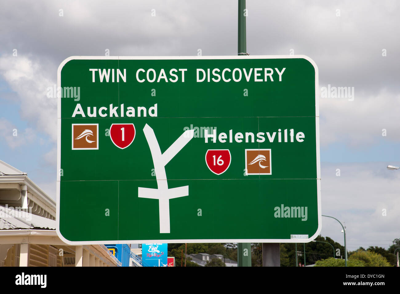


While FHWA fonts rule the road, council street signs are a different matter. National sign rules allow local councils to choose between FHWA, Transport, DIN 1451, Helvetica, Univers, Frutiger, and Gotham. Private signs like the one below for the Devonport Museum can almost go for what they like.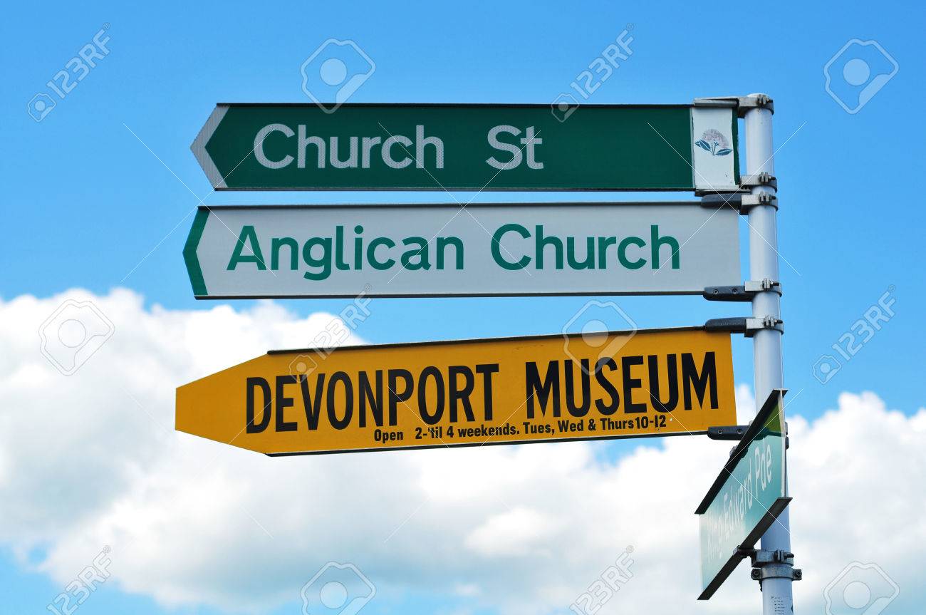
Comment from andrepoiy on 9 November 2017 at 21:50
Highway Gothic
Comment from geoboi on 9 November 2017 at 22:03
@Litvania that was totally necessary. I honestly feel that some questions I have can’t be asked because some answers like the ones we see in this thread are bound to show up. I love the collaboration of this site, I just wish that the collaboration went beyond the mapping.
Getting engaged in the community will help users develop even more of a desire to map, and they will even develop their own “style” of mapping based on the users that support them.
I am actually a relatively new user, so I actually found this really helpful when I was just starting out.
Comment from Myrcia on 9 November 2017 at 22:07
I designed some street signage for Dunwic as part of the wider graphic identity
Comment from PortCal on 9 November 2017 at 23:43
Paroy uses Transport, the same font that is used in the British road signs too, in combination with a mix between an both American and British-styled sign design.
For street signs in cities and municipalities, it really depends on local governments what fonts are used. The only one yet is the street sign from Primrose Avenue in Trevers, which uses the Malter Sans font.
Comment from Sarepava on 10 November 2017 at 00:27
Karolia uses Segoe UI (usually demibold) for road signs.
There is a special motorway (Autoraud) symbol which consists of a stylised ‘A’
RVK-KSF generally uses Sansation Bold.
Comment from zhenkang on 10 November 2017 at 00:48
I don’t know how to design such cool oad signs. Maybe in the future I will message around with Photoshop.
Comment from wangi on 10 November 2017 at 01:44
What, nobody is using Comic Sans, huh?
Comment from Ernestpkirby on 10 November 2017 at 02:01
I didn’t realize we were discussing the entire road sign set up XD so here’s an actual picture of one of the designed motorway signs using Roboto font (Google Drawings- not sure if the font exists in other programs). The signs are mostly based on US signage, but with a white and gold color scheme inspired by some proposals I’d seen for redoing the U.S. system. I was honestly inspired a lot by Paroy’s, but I’ve found it difficult/tedious to do that level of graphic design. I tend to just focus on the maps and trying to make it envision what’s in my head
Comment from superleaf1995 on 10 November 2017 at 02:18
iam using arial but not using it in opengeofiction. lol
Comment from dryerlint on 10 November 2017 at 06:42
Some of these are really nicely designed! Are they just done in Photoshop and such, or is there a special program for this stuff?
Comment from Marcello on 10 November 2017 at 09:13
I started with Photoshop, but lately work mostly in Inkscape, especially after i discovered that Inkscape has layers, too (a feature I really liked and used extensively in photoshop). Inkscape has a bit of a steep learning curve, but the more I know it, the more I like it.
[[File:Nuevo_Espiritu_Motorwaysign_1c.png|800px|center|A sample sign of the motorway system.]] This is my one and only try so far. It’s crude, but i think decent for a first try. I used Inkscape’s defaul sans-serif font.
Marcello.
Comment from Sarepava on 10 November 2017 at 09:36
Inkscape is a fantastic (and free) tool for professional-looking artwork. There is a small learning curve but you can do nearly everything important with about 5 tools.
Paint.NET is also well worth looking into. It’s not a vector graphics program but is intuitive (intended as a replacement for MS Paint) and powerful.
The renders I put in the other thread and elsewhere are Sketchup models rendered in Kerkythea (also freeware programs).